On August 22nd [2009] about 30 international school librarians from around Asia gathered at ISB in Bangkok for a one-day workshop on library design by Kevin Hennah, a retail merchandising consultant and designer who has done a lot of work with libraries in Australia.
(While he seems to have worked with many major companies, it was this advertising campaign in his portfolio that made the biggest visual impression on me: Australia Post: If you really want to touch someone, send them a letter. I should also mention his featured section in the Australian book, Rethink! Ideas for Inspiring School Library Design -- and I think he said he's working on a book with Opening the Book in the UK. )
The success of the workshop can be summed up by Barb Philip's comment as she walked out: "I feel like taking a sledgehammer to my library."
What did he say? Well, others who attended the workshop have been much more efficient in sharing about it online. Within 24 hours Kim Cofino, one of the event organizers, had blogged about it and Tara Ethridge, the other event organizer, blogged about it on Monday the 24th. Anthony Tilke posted information about it on the ECIS iSkoodle forum for librarians (registration required to view), and Beth Gourley made public her Evernote notebook on Library as Space and Place, which includes her notes on Kevin's presentation.
What can I add? A few extension links, perhaps...
Kevin's value was in his slideshow presentation -- talk about visual learning! We saw over 600 images, illustrating retail principles in practice in libraries. He talked us through before-and-after shots, good examples, bad examples, interesting examples. (And, no, for copyright reasons, he said he couldn't give us copies of his presentation.)
As Kevin spoke, I kept scribbling down the names of the libraries being shown (mainly Australian and more public than school ones) -- see the list of libraries here. I tried to find images of them on the internet, without much success -- except for The Idea Stores in London (UK), e.g., search of Flickr for "idea store" and "library".
Instead you might have a look at some of these libraries:
- The Robin Hood project in New York City, where prominent architects went in and re-vamped poor school libraries. See "The Library Book" here. See also Maira Kalman's video clip of how she created one library's alphabet display.
- DOK
- InfoToday: Discover Innovations at DOK, Holland’s 'Library Concept Center';
- DOK Delft's Flickr photos showing their library's design and interior'
- DOK Library Concept Center -- Flickr photos from The Shifted Librarian
He recommends a "What's Hot?" display (see how Barb went back and immediately put that up on the wall in her library).
Kevin is all for ditching Dewey and using more user-friendly, bookstore-type categories to organize books. He cited the Palmerston Public Library (NT, Australia) as an example of a library choosing to organize the collection in terms of 17 "living rooms" or categories (read this 2006 white paper "Where's the Dewey?" for background on the process they went through).
Similar attempts:
- It's Fine To Drop Dewey - 7/15/2009 - Library Journal -- article re another US library ditching Dewey;
- Rangeview Library District, CO, First System To Fully Drop Dewey - 6/5/2009 - Library Journal;
- Behind the Maricopa County Library District’s Dewey-less Plan - 5/31/2007 - Library Journal
- Library Matters: To Dewey or not to Dewey . . . -- re a NZ library considering it;
- Arizona Library Ditches Dewey - 7/1/2007 - School Library Journal
- Freeing Dewey -- a blog from a US public library in the process of dropping Dewey;
- LibraryThing's Open Shelves Classification (OSC) Project -- a free, "humble," modern, open-source, crowd-sourced replacement for the Dewey Decimal System;
The National Library of Singapore has its own variation on re-grouping Dewey, supposedly to help the public find books, but I find it confusing -- as the catalog just gives me the Dewey number - so I have to wander to find the section that Dewey number is stored in.


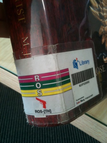
One thing I do like about the NLB shelves is the use of ColorMarq, a library shelf ID system where each letter of the alphabet has a different color. It makes it easy to see when a book is mis-shelved. (I do have a problem when NLB shelvers only bother to sort by the first three letters of the authors' names.... especially in areas like BRO or WIL.)


